
How I Built a Systems Atlas, and Why Drawing the Map Was Never the Hard Part
A practical walkthrough of building a systems atlas: the seven questions it has to answer, evidence based discovery instead of surveys, the schema that is the actual product, ownership as a social problem, decision records with a revisit condition, an interface where the relationships are the navigation, and the freshness protocol that keeps the whole thing alive after you stop looking at it.
Someone asked me a simple question a while back. If we change this one thing, what breaks?
Nobody could answer it. Not because the people were bad at their jobs, but because the answer lived in about nine places at once. Part of it was in a diagram somebody made two reorgs ago. Part of it was in a spreadsheet that had been forwarded so many times the original author was gone. Part of it was in one engineer's head, and that engineer was on vacation. Most of it was in a chat thread nobody could find anymore.
So we did what everybody does. We scheduled a meeting to find out. Then another meeting. Then we made a decision anyway, with maybe seventy percent confidence, and hoped.
That is the moment I decided to build a systems atlas. This is how I did it, what I got wrong, and what I would hand to you if you wanted to build one next week.
I am deliberately keeping this vendor neutral and organization neutral. Every example below is illustrative. The method is the point, and the method travels.
First, what a systems atlas actually is
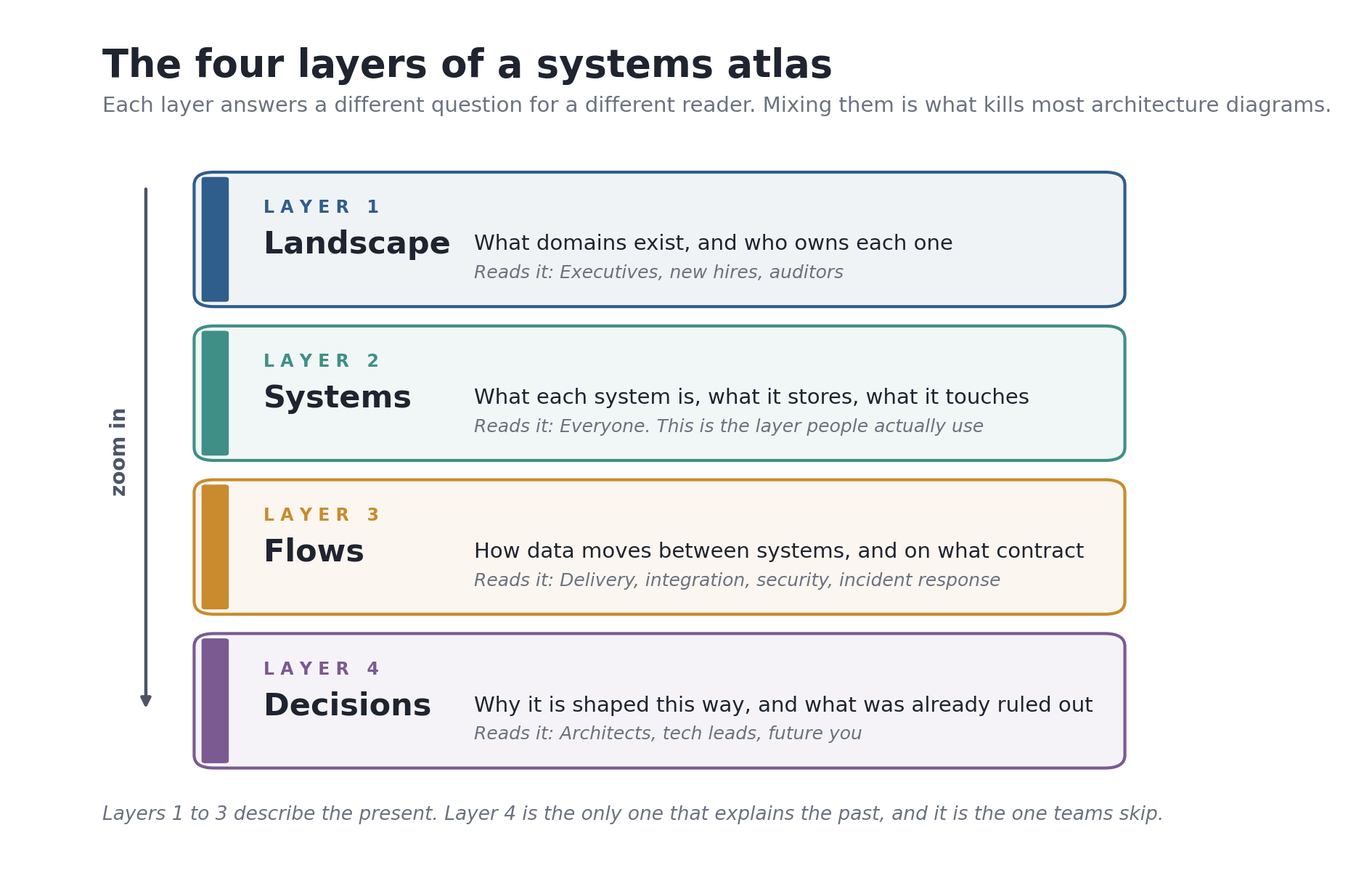
The word atlas is doing real work here, so let me define it before we go further.
An atlas is not a single map. It is a bound collection of maps at different zoom levels, drawn to a consistent standard, with an index that tells you which page to turn to. A road atlas has a country page, a region page, and a city page. Nobody complains that the country page is missing street names, because everyone understands which page they are looking at.
That is exactly the property most architecture documentation lacks. Simon Brown, who created the C4 model, made this analogy the center of his work. He describes the goal as creating "maps of your code" at different levels of detail, and frames the whole thing memorably: "Think of it as Google Maps for your code." (Brown, InfoQ, 2018)
Brown is talking about a single software system. A systems atlas applies the same discipline one altitude higher, across the whole estate: every system, every integration, every owner, and the decisions that got you here.
Here is what it is not.
It is not a CMDB. A CMDB tracks configuration items for operational purposes and is usually machine generated, machine consumed, and unreadable to a human trying to orient themselves.
It is not an architecture diagram. A diagram is a single picture at a single moment. An atlas is a maintained collection with a refresh cadence.
It is not a wiki. A wiki is a place. An atlas is a structured dataset that happens to render as pages.
And it is not a project. This is the one that matters most, and I will come back to it.
Rule zero: write the questions before you draw anything
The single best decision I made was refusing to open a diagramming tool for the first two weeks.
Instead I wrote down the questions the atlas would have to answer. Not topics. Questions, phrased the way a real person would actually ask them, in their own words. The list ended up looking like this:
- If we change this system, what else is affected?
- Who do I talk to about this thing, and who covers them when they are out?
- What data does this system hold, and how sensitive is it?
- What talks to what, in which direction, and how often?
- Why is it built this way, and what alternatives were already rejected?
- What is the oldest thing here that nobody has touched in two years?
- If this system went down at 2am, who gets paged and what else falls over?
Seven questions. That list became the acceptance criteria for the entire effort. If a proposed field or diagram did not help answer one of those seven, it did not go in.
I cannot overstate how much this saved me. Every systems mapping effort I have watched fail, failed the same way: it tried to capture everything, got about sixty percent through, ran out of political energy, and left behind an artifact that was too incomplete to trust and too large to finish. Scope discipline is not a nice-to-have here. It is the whole game.
The industry data backs this up bluntly. One review of application portfolio practice notes that for most teams "their application inventory is never complete" (Virima, 2026). Another puts the failure mode plainly, describing the inventory as "a one-time exercise or, at best, a periodic snapshot" (North Highland). Both are describing the same disease. Completeness is the wrong target. Answering the seven questions is the right one.
Discovery, not a survey
My first instinct was to send a form. Ask each team to list their systems. Compile the responses.
That instinct is wrong, and I want to be specific about why.
Surveys return what people remember, filtered through what they think you want to hear, on a day when they were busy. They systematically miss three categories: things that are running but unloved, things somebody bought on a credit card, and things that everyone assumes somebody else already reported. Those three categories are exactly where your risk lives.
So I built the first pass from evidence instead:
- Billing and procurement records. Money is honest. If an invoice is being paid, something exists. This one exercise surfaced more than any conversation did.
- Identity and single sign-on logs. What are people actually authenticating into, and how often? Zero logins in ninety days is a finding.
- Network and DNS records. What is reachable, and what is answering?
- Repository and pipeline configuration. What gets deployed, and where do deploy targets point?
- Ticket queues. What do people file complaints about? Named systems appear in ticket text constantly.
Only after that did I go to humans, and I went with a draft. This changes the conversation completely. "Please list your systems" gets you a shrug. "I have you owning these eleven things, is that right, and what did I miss?" gets you a corrected list in ten minutes, because reacting is easier than recalling.
That reframe alone probably cut the discovery phase in half.
The schema, which is the actual product
Here is the part nobody wants to hear. The most valuable artifact I produced was not a diagram. It was a schema.
A diagram is a rendering. If your underlying data is structured well, you can generate ten different diagrams from it. If your underlying data is a picture, you have nothing but a picture.
So every system in the atlas is a small structured file. Here is the shape, genericized:
id: sys-0142                      # stable, never reused, never renamed
name: Invoice Reconciliation Service
aliases: [IRS, recon-svc]         # what people actually call it in chat
status: active                    # active | deprecated | sunset-planned | retired
tier: 2                           # 1 = revenue or safety critical

purpose: >
  Matches inbound payment files against open invoices and
  flags exceptions for manual review.

ownership:
  business_owner: role://finance-operations-lead
  technical_owner: role://platform-team-b
  escalation: rota://platform-oncall
  # roles, not names. people change jobs. roles outlive them.

data:
  classification: confidential    # public | internal | confidential | restricted
  retention: 7y
  personal_data: true
  system_of_record_for: [invoice-exception-state]

lifecycle:
  first_seen: 2019-04
  last_major_change: 2025-11
  vendor_support_ends: 2027-06

interfaces:
  inbound:
    - from: sys-0088
      mechanism: sftp-batch
      cadence: daily-0200
      contract: docs/contracts/payment-file-v3.md
  outbound:
    - to: sys-0201
      mechanism: rest-api
      cadence: on-event
      contract: docs/contracts/exception-events-v2.md

confidence: medium                # how much do we trust this entry
last_verified: 2026-07-14
verified_by: role://platform-team-b
decisions: [adr-0031, adr-0057]
A few of those fields deserve explanation, because they are the ones that took me a second attempt to get right.
id is stable and meaningless. Names change. Systems get rebranded during reorgs. If your identifier is the name, every rename breaks every link. Give it a dumb number and never touch it again.
aliases is not decoration. People search for what they call things, not what the org chart calls them. Populating aliases from ticket text and chat search made the atlas findable overnight.
Ownership points at roles, not people. This is the single highest-leverage schema choice in the whole thing. If you write a person's name, your atlas starts rotting the day someone gets promoted. Roles survive.
confidence and last_verified are load-bearing. An atlas that shows uncertain entries as if they were certain is worse than no atlas, because it converts "I do not know" into "I was confidently wrong." Letting an entry say medium confidence is what makes the high confidence entries trustworthy.
Ownership is a social problem wearing a technical costume
I budgeted about a week for ownership. It took considerably longer than that, and it was the most educational part of the build.
Here is what happens when you ask who owns something. Sometimes you get a clean answer. Sometimes you get two teams who both think they own it, which is annoying but tractable. And sometimes you get the bad one: everybody points at somebody else, and you have found an orphan.
Orphans are the actual output of an ownership exercise. They are systems that are running, in the critical path, being paid for, and accountable to nobody. Every organization has them. Most do not know how many.
I stopped treating orphans as a data problem to solve quietly and started treating them as a finding to escalate. A short list titled "systems currently owned by nobody" gets leadership attention in a way that a completeness percentage never will.
This connects to something Matthew Skelton and Manuel Pais argue in Team Topologies: team cognitive load is finite, and when you hand a team more systems than it can hold in its head, quality degrades in ways that look like individual failure but are structural (Skelton and Pais, 2019). Once ownership data existed, that load became visible. Some teams were carrying two systems. Some were carrying seventeen. That was not a documentation insight. That was a staffing conversation, and it happened because a map existed.
Which is really just Conway's law showing up on schedule. Melvin Conway's 1968 observation was that the structures organizations build end up mirroring their communication structures (Conway, 1968). Map the systems honestly and you have accidentally drawn a portrait of how the organization talks to itself. Sometimes that portrait is unflattering. That is useful information.
Flows, and the discipline of naming the contract
Layer 3 is where most atlases get vague. People draw a line between two boxes, label it "data," and move on.
A line is not information. What I required for every connection:
| Field | Why it matters |
|---|---|
| Direction | "Talks to" is not a direction. Push or pull changes everything downstream. |
| Mechanism | Batch file, REST, message queue, database link, or a person copying a spreadsheet. |
| Cadence | Real time, hourly, nightly, or on-event. Determines blast radius during an outage. |
| Contract | A link to the actual schema or interface definition, not a description of it. |
| Failure mode | What happens if this connection stops? Queue and retry, silent drop, or hard stop? |
That last row changed how people used the atlas. Once every flow declared its failure mode, incident conversations got noticeably faster, because responders could see which dependencies degrade gracefully and which ones fail hard.
The "person copying a spreadsheet" mechanism deserves special mention. Manual integrations are real integrations. They have latency, error rates, and a single point of failure who takes vacations. Leaving them off the map because they are embarrassing is how the map becomes a lie. Some of the most consequential entries in the whole atlas were manual steps that nobody had ever written down.
Layer 4: the decisions, which is the layer everybody skips
Layers 1 through 3 describe what is true right now. They cannot tell you why.
Why is a bigger deal than it sounds. When a new person encounters a strange design, they have two options: assume there was a reason, or assume it was a mistake. Without a record, most people eventually assume mistake, and then somebody "fixes" it, and then the original constraint reasserts itself six months later with interest.
The fix is a pattern that has been around for years and is still underused. Michael Nygard proposed architecture decision records in 2011, on the argument that nobody reads large documents, but losing the rationale behind significant decisions leads to later decisions that quietly undo the earlier ones (Nygard, 2011). The format is small on purpose: title, status, context, decision, consequences. One decision per file. Two pages at most.
# ADR-0031: Batch reconciliation instead of event streaming

Date: 2025-11-03
Status: Accepted
Supersedes: ADR-0012

## Context
The upstream provider publishes a settlement file once daily and offers
no event API. Downstream consumers requested near real time updates.

## Decision
We will keep a nightly batch pipeline and expose an event feed derived
from batch output, rather than building a streaming ingest path.

## Consequences
Positive: no dependency on a capability the provider does not offer.
Positive: simpler failure recovery, one reprocessable artifact per day.
Negative: downstream freshness is capped at 24 hours. Documented in the
service description so consumers do not design around a promise we
cannot keep.
Revisit if: the provider ships an event API, or a consumer presents a
business case that a daily cap actually blocks.
That "revisit if" line is not in Nygard's original template. I added it, and it turned out to be the most valuable line in most of the records. It converts a decision from a permanent verdict into something with an explicit expiry condition, which makes people far more willing to write one down. A decision you can revisit is easier to commit to than a decision that feels like a life sentence. There is a good catalog of format variants at adr.github.io if you want to compare templates before you pick one.
Fighting decay, which is the entire long game
Everything above gets you to launch. None of it keeps you there.
Documentation decays. It decays quietly, which is the dangerous part, because there is no error message when a page becomes wrong. It just sits there looking authoritative.
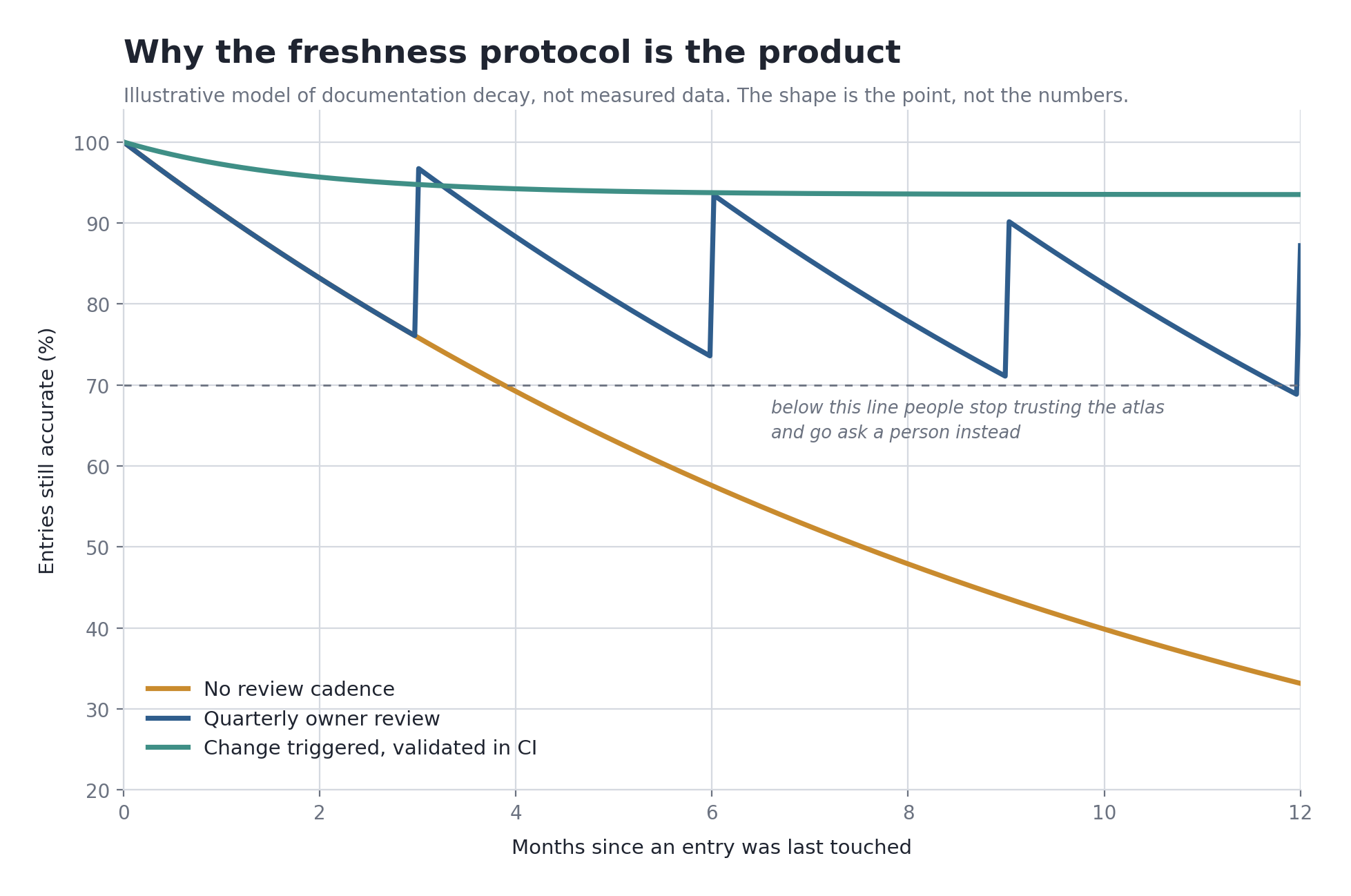
There is a threshold effect here that matters more than the slope. Once enough entries are wrong, people stop checking the atlas and go ask a person instead. And once they do that, they stop reporting errors, so decay accelerates. It is a trust cliff, not a gentle decline, and once you go over it the atlas is functionally dead even though the pages still load.
Three controls, in increasing order of effectiveness:
Quarterly owner review. Every named role gets a short list of their entries and a request to confirm or correct. Keep it small enough to do in fifteen minutes or it will not get done. This is a floor, not a ceiling, and the chart above shows why: it fights decay but does not stop the underlying drift.
Change-triggered updates. The atlas entry is updated as part of the change that made it stale, not in a cleanup pass afterward. This means putting the atlas file in the same repository as the thing it describes and adding it to the definition of done.
Automated validation. This is the one that actually works. Every entry gets checked mechanically, on every build: does the schema validate, does the owner role resolve to a real current role, has anything gone past its verification threshold, are there broken contract links, are there orphaned or circular references?
The failure mode is not usually laziness. It is that updating the map is a separate task from doing the work, so it competes with the work and loses. Automation and colocation remove the competition.
This is not just my opinion. DORA's research program has repeatedly found that internal documentation quality is not a soft nice-to-have but a capability that amplifies the effect of other technical practices, driving implementation of essentially every practice they studied (DORA, Documentation Quality). Good documentation does not just describe the system. It changes what the team is able to do.
The stack, concretely
I want to be specific here, because "we used a tool" is not a useful answer to anybody.
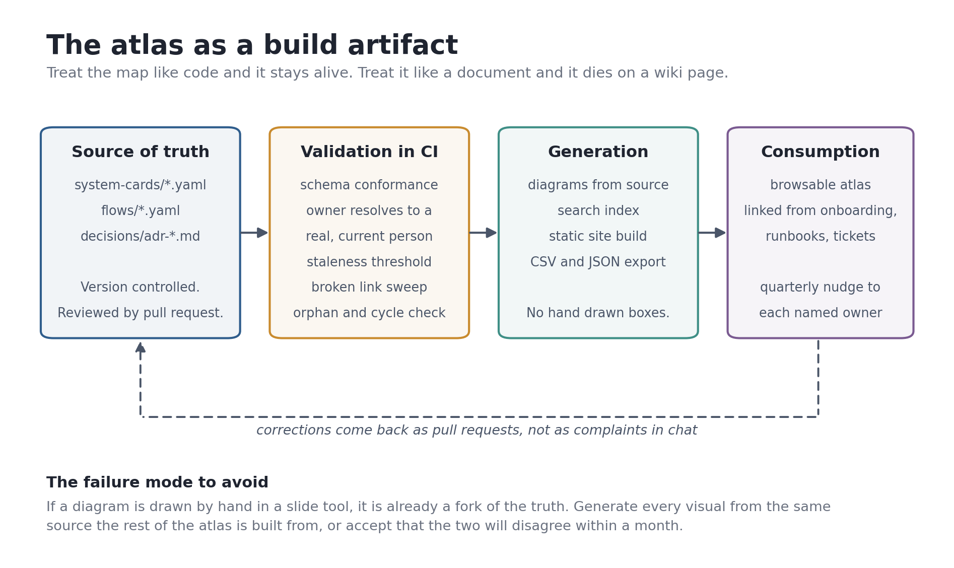
- Source of truth: plain YAML files in version control, one per system, plus Markdown for decision records. Boring, diffable, greppable, and reviewable through the same pull request process as everything else.
- Validation: a JSON Schema definition plus a small script in continuous integration. Broken entries fail the build. This is the piece that does the real work.
- Diagram generation: diagrams generated from the source data rather than drawn. Mermaid handles most of it and renders natively in a lot of places. Structurizr is the stronger option if you want to hold a proper C4 model and render several views from one description.
- Publishing: a static site generator producing a searchable, linkable site. Every system gets a stable URL. That last detail matters more than it sounds, because a stable URL is what lets people paste the atlas into tickets and incident channels, which is how it enters daily use.
- Export: CSV and JSON endpoints, so people can pull the data into their own analysis without asking me for it.
The tool choices are genuinely not the interesting part. The architectural decision is this: source data separate from rendering, validated automatically, versioned like code. Any tool that lets you do that will work. Any tool that does not, will not, no matter how good the demo looks.
One warning from experience. If any diagram in your atlas is hand drawn in a slide tool, it has already forked from the truth and will drift further every week. Generate every visual from the same source, or accept that your pictures and your data will start disagreeing within a month.
Designing the page so the links are the interface
Everything above is about the data. This part is about the thing people actually touch, and I spent more time on it than I planned to.
Here is the problem with a system card rendered as a flat page. Somebody arrives looking for one system, reads it, and hits a dead end. At the bottom there is a list of related systems written out as plain text, so the only way to follow a relationship is to go back to search and type the next name in. That friction sounds trivial. It is fatal. People do it twice, decide the atlas is slower than asking a human, and go ask a human.
So the design brief was one sentence. The relationships are the navigation.
Here is the shape of it, drawn for a fictional company so nothing in it is anybody's real estate. Zoom levels sit in a rail on the left. The estate itself reads top to bottom in five bands: what arrives from outside, the surfaces people touch, the domain platforms where the work happens, the integration fabric everything writes through, and the data foundation with the one door out. The declared flows are drawn across the bands as lines you can step through one at a time, and the panel on the right is what opens when you select a system.
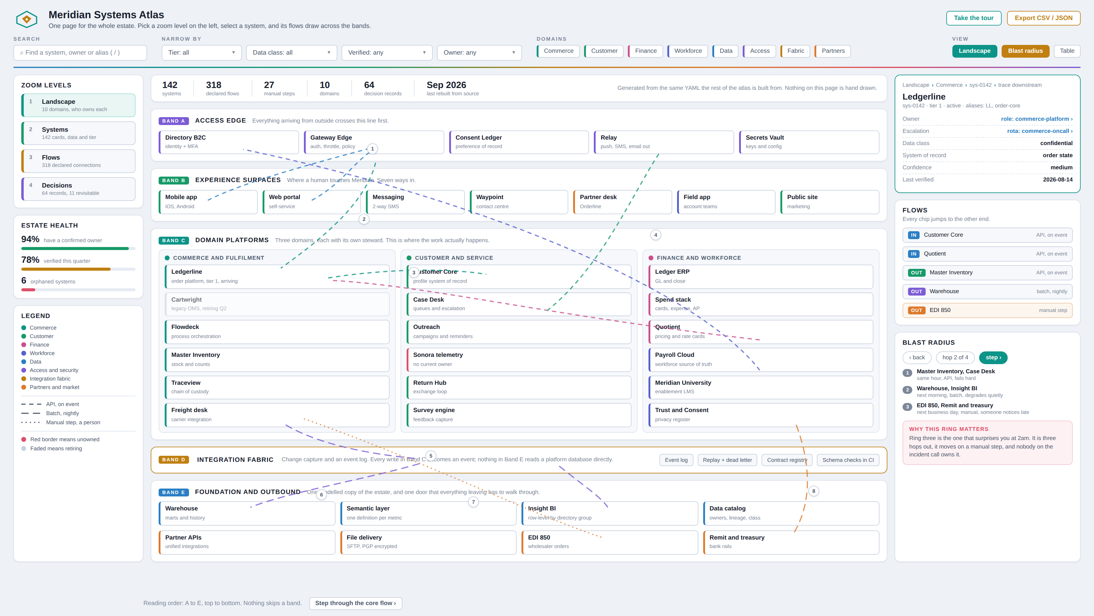
Two things about that board are worth pulling out before the detail view. The bands are layers of the estate, not teams, so a reorg does not redraw the page. And the legend on the left is doing real work: every colour maps to a domain in the schema and every line style to a mechanism, so nothing on the picture is decorative.
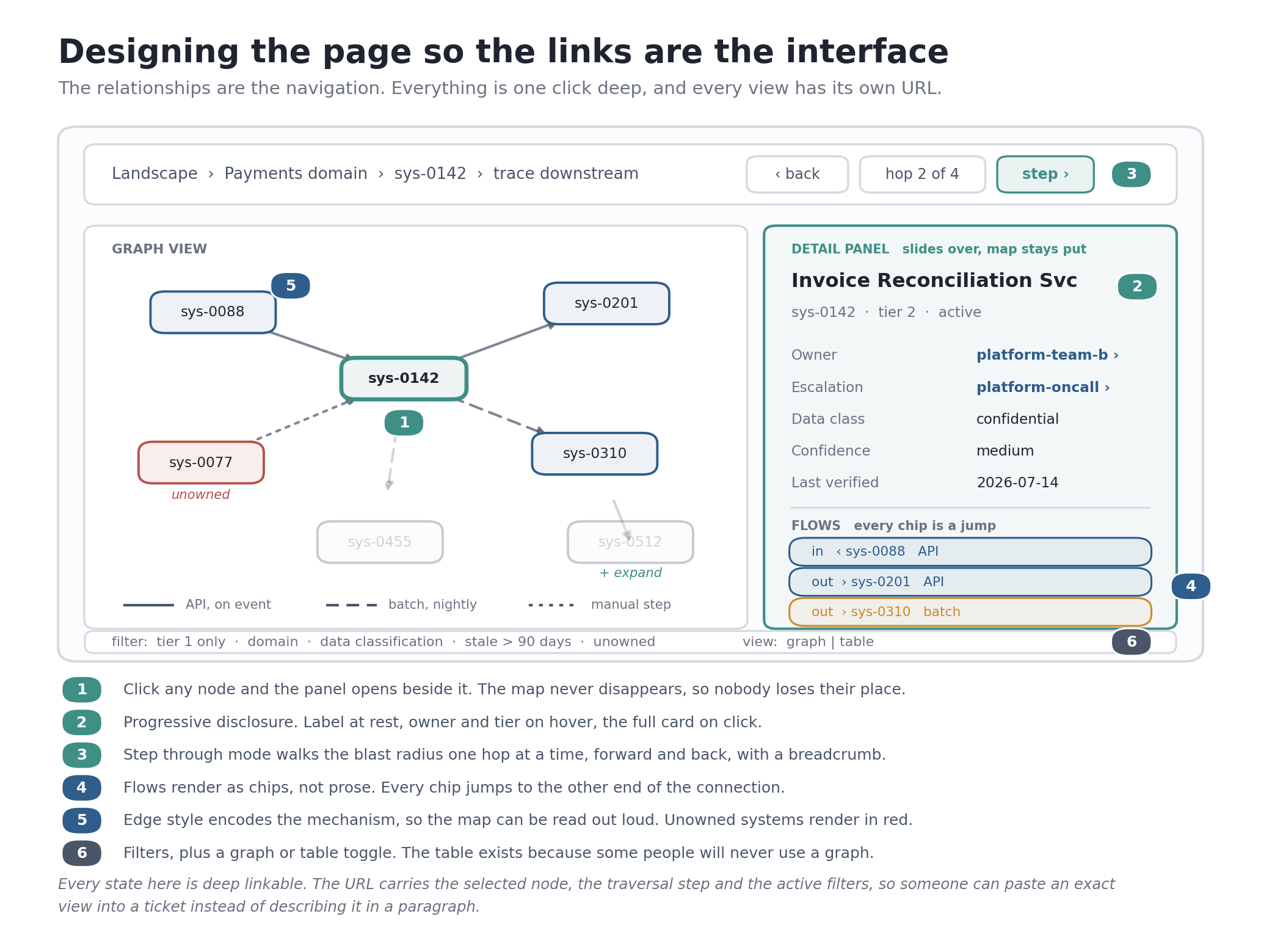
Three things came out of that brief.
The graph is the landing view, not an appendix
Most documentation puts a diagram halfway down the page as an illustration. I inverted it. You land on a live graph, and the text is what appears when you ask for it.
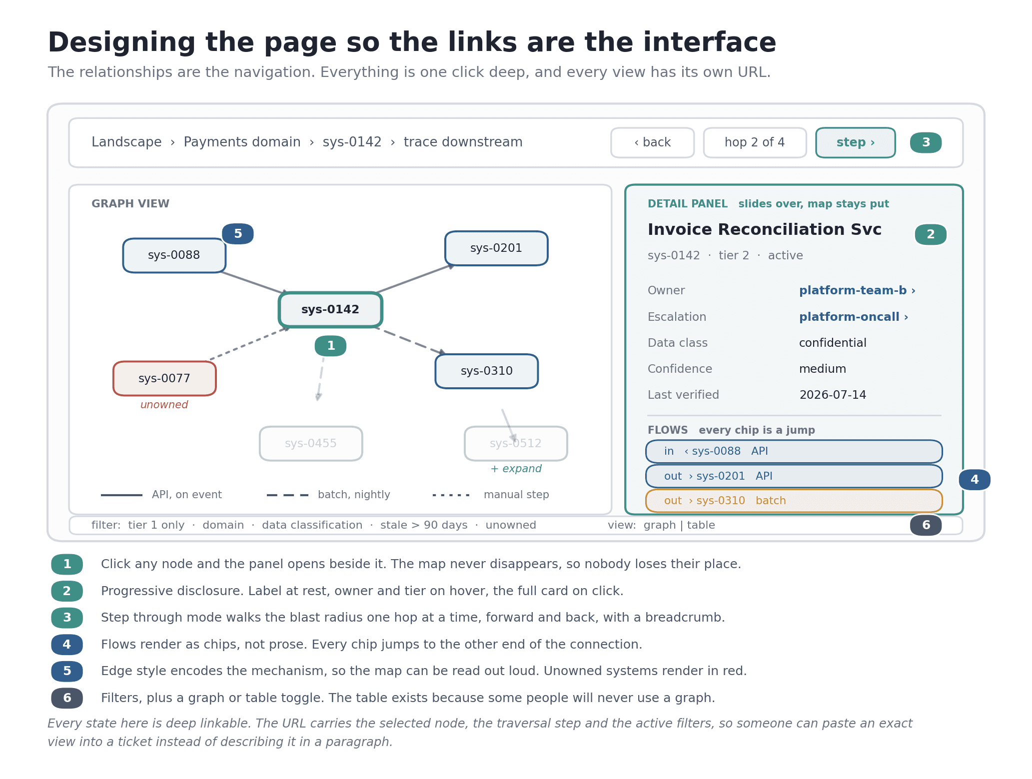
Every node is a system. Every edge is a declared flow from the schema, which means the picture cannot disagree with the data, because it is the data. Three visual encodings do the heavy lifting:
- Node size follows tier. Tier 1 systems are visibly larger. You can see the important things without reading anything.
- Edge style follows mechanism. Solid for an API call, dashed for a batch job, dotted for a manual step where a person moves the data by hand. This is the one that surprised people. When somebody sees a dotted line running into a tier 1 system, the conversation starts itself.
- Border color follows ownership health. Unowned systems render in red. Nothing else on the page is red. An orphan is impossible to miss, and that is deliberate.
Simon Brown makes a point about writing relationship labels so a diagram can be read out loud without the author standing next to it. Encoding mechanism into the line style is the same idea applied to the edges. You should be able to look at a connection and say what it is without consulting a key.
Clicking opens a panel, not a new page
This is a small decision that changed how the thing feels.
When you click a node, a detail panel slides in beside the graph. The map stays exactly where it was. Nothing reloads, nothing re-centers, and your place is preserved.
Compare that to a normal page navigation, where clicking a system takes you somewhere else and the spatial context you had built up is gone. Coming back means re-orienting from scratch. Do that four times while tracing a dependency and you have lost the thread of what you were actually trying to find out.
The panel runs progressive disclosure in three levels:
- At rest, a node shows its identifier only. Keeps the graph readable.
- On hover, a small tooltip adds the owning role, the tier, and the last verified date. Enough to decide whether to click.
- On click, the full card opens: purpose, owner, escalation path, data classification, confidence, verification date, and the flows.
Inside the panel, the flows render as chips rather than sentences. Each chip is a jump to the other end of that connection. That is the mechanism that makes the whole thing traversable. You are never more than one click from any neighbour.
Step through mode, which is the part people remember
This is the feature that answers the original question, the one nobody could answer in that first meeting. If we change this, what breaks?
Reading a graph does not really answer that. Walking it does.
Pick a system, hit trace downstream, and the atlas advances one hop at a time. Each click lights up the next ring of affected systems, dims everything outside the current radius, and adds a step to the breadcrumb at the top. You can step forward, step back, or jump to any point in the trail.
Why one hop at a time instead of showing the whole downstream tree at once? Because the whole tree is a wall. Twenty systems highlighted simultaneously tells you nothing about which ones are close and which are four steps removed through a nightly batch. Stepping preserves distance, and distance is most of the answer. First ring is your blast radius today. Third ring is the thing that surprises you at 2am.
The breadcrumb matters more than it looks. It gives you the path you took, in order, which is exactly what you paste into a change request when somebody asks how you assessed impact.
The implementation details that made it work
Every state is deep linkable. This is the single most important technical decision on the page. The URL carries the selected node, the traversal position, and the active filters. That means somebody can send you a link to an exact view rather than a paragraph describing how to recreate it. Once people could paste a specific view into a ticket or an incident channel, adoption stopped being something I had to push.
The graph is generated, not drawn. The build produces a JSON file of nodes and edges from the same YAML the rest of the atlas is built from, and the page renders that client side. There is no second copy of the truth anywhere.
Prune by default. The default view shows two hops from wherever you are, with an explicit control to expand further. My rule of thumb is that if the default view has more than roughly twenty five nodes, you have built art rather than a tool. A full estate graph looks impressive in a screenshot and teaches nobody anything. Nobody has ever learned something from a hairball.
A table view sits behind a toggle, with equal weight. Some people will never use a graph. That is not a failure of the graph, it is just how people differ. The table gets the same data, sortable and filterable, and it is the view that gets exported when somebody wants to do their own analysis.
Accessibility was not an afterthought. The whole graph is keyboard navigable, arrow keys move between connected nodes, and the panel is a proper focus target. Nothing critical is encoded in color alone, which is why mechanism lives in the line style and ownership status is also stated in text on the card. The table view doubles as the screen reader path.
Filters are part of the URL too. Filter to tier 1, or to anything unverified in ninety days, or to everything with no owner, and that filtered state has an address you can share. The "unowned systems" view I mentioned earlier is not a separate page. It is just a saved filter.
How I shared it, which mattered as much as building it
A finished atlas that nobody opens is a hobby. Rollout was a real workstream, not an afterthought.
I did not announce it. Announcements produce a spike of curiosity followed by nothing. Instead I answered questions with it. Someone asks a dependency question, I answer with a link. Someone asks who owns a thing, I answer with a link. Do that for a few weeks and people start going to the link directly.
I ran the new hire test. I gave the atlas to someone in their first two weeks and asked them to answer the seven original questions using only the atlas. Then I watched without helping. Everywhere they got stuck was a defect. This was the most useful single hour of feedback in the whole project, and I would run it earlier next time.
I embedded it in existing rituals rather than creating new ones. Onboarding checklists link to the landscape view. Incident templates link to the flow view. Change requests link to the affected system cards. Nobody has to remember the atlas exists, because it shows up inside work they were already doing.
I made the owner review a nudge, not a meeting. A short automated note to each role with a link and a fifteen minute ask. Meetings would have killed it.
I published the gaps. A page listing unowned systems, low confidence entries, and stale records. Counterintuitive, but showing the holes builds more trust than pretending there are none. It also crowdsources fixes, because people who know an answer will fill it in when they can see it is missing.
I gave it a public scoreboard. Percentage of systems with a confirmed owner, percentage verified in the last quarter, number of orphans. Three numbers, visible to everyone, updated automatically. What gets measured gets maintained.
Handing it to the people who own the domains
Here is the thing I had to accept early. If the atlas depends on me, it has an expiry date, and that date is whenever I get busy with something else.
An atlas maintained by one person has a bus factor of one and a decay clock running in the background. The whole point of the freshness machinery is to survive its author. So the last phase of the build was not technical at all. It was handing the thing over.
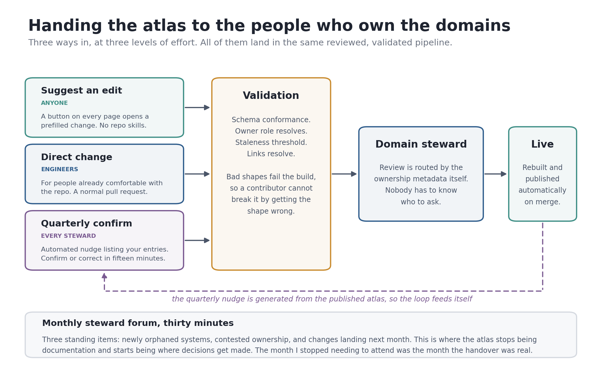
Stewards, not a documentation team
Each domain nominates a steward. This is important: a steward is not a new job, and it is not a documentation role. It is a named accountability attached to a role that already exists, usually a tech lead or a senior engineer who was already the person everybody asked anyway.
The steward owns four things:
- The entries inside their domain
- The quarterly confirmation for those entries
- Review of any change another team proposes to their domain
- Raising newly orphaned systems when they appear
That is roughly an hour a quarter for most people, plus review time that folds into work they were already doing.
One warning that took me a while to see. Draw steward boundaries along domain seams, not along the org chart. If you assign stewardship by reporting line, you get systems split across three stewards because of how a reorg landed, and every change needs three reviews. Skelton and Pais call these natural splitting lines fracture planes, and the advice applies just as well to who maintains the map as to who builds the software.
Three ways in, at three levels of effort
The contribution path has to be easier than complaining. If filing a correction is harder than mentioning it in a chat thread, you will get chat threads, and chat threads do not update anything.
Suggest an edit. Every page has a button. It opens a prefilled change with the current values already in the form. No repository knowledge, no schema knowledge, no tooling to install. This is the path for the person who noticed something wrong while looking for something else, which is most corrections.
Direct change. For people already comfortable in the repository, a normal pull request. Same review, same validation, no special process.
Quarterly confirmation. The lowest effort path with the widest coverage. An automated message lists your entries with their verification dates and asks you to confirm or correct. Fifteen minutes, and it generates itself from the published atlas, so the loop feeds its own next cycle.
Routing, so nobody has to know who to ask
Review requests route automatically off the ownership metadata already in the file. Change something in the payments domain and the payments steward gets the review request. You do not have to know who that is, and it stays right through reorgs because the routing reads from the atlas rather than from a list somebody maintains separately.
This is a small piece of plumbing that removes a surprising amount of friction. The most common reason a correction never gets filed is that the person does not know who to send it to.
The schema fails loudly, which lowers the bar
This one is counterintuitive. Strict validation makes contribution easier, not harder.
People hesitate to edit shared documentation because they are afraid of breaking something or getting the format wrong in front of colleagues. When the build validates every change against the schema and gives a clear error, that fear goes away. You cannot silently corrupt the atlas. The worst case is a failed check with a message telling you which field is wrong.
Strictness in the machine buys you looseness in the culture. That trade is worth making.
Give each domain its own numbers
Every domain gets a scorecard page: how many of its systems have a confirmed owner, how many were verified this quarter, how many are orphaned, how many entries sit at low confidence.
Three effects, all useful. Stewards can see their own state without asking. Gaps become specific rather than a vague sense that the atlas is incomplete. And a mild, entirely voluntary competitive dynamic appears between domains, which I did not engineer and would not have predicted.
I also publish contribution counts. People maintain what they get credited for, and documentation work is usually invisible. Making it visible costs nothing.
The monthly forum, which is where it stops being documentation
Thirty minutes a month with the stewards. Three standing items:
- Systems that became orphaned since last time
- Contested or unclear ownership
- Changes landing in the next month that will move the map
That third item is the one that changed the character of the whole thing. Once people started bringing upcoming changes to the forum, the atlas stopped being a record of the past and started being where you check before you commit to something. That is a different artifact entirely, and it is worth more than the documentation ever was.
The application portfolio literature lands in the same place from a different direction. Practitioner guidance on portfolio governance is blunt that governance has to start with governing ownership specifically, because people change responsibilities and leave, and every departure opens a gap that has to be filled promptly or the data quietly rots (ServiceNow Community, Application Portfolio Management inventory practices). Ownership is not a field you populate once. It is a thing you keep populating forever.
The exit test
The measure I used for whether the handover was real was simple, and it was not a metric on a dashboard.
Changes started landing without me reviewing them. Stewards corrected each other's domains. Somebody added a field to the schema that I would not have thought of, argued for it in a pull request, and it was better than what I would have done.
The month I stopped needing to attend the forum was the month the handover was actually complete. If you build one of these, that is the finish line to aim at, not launch day.
What I would do differently
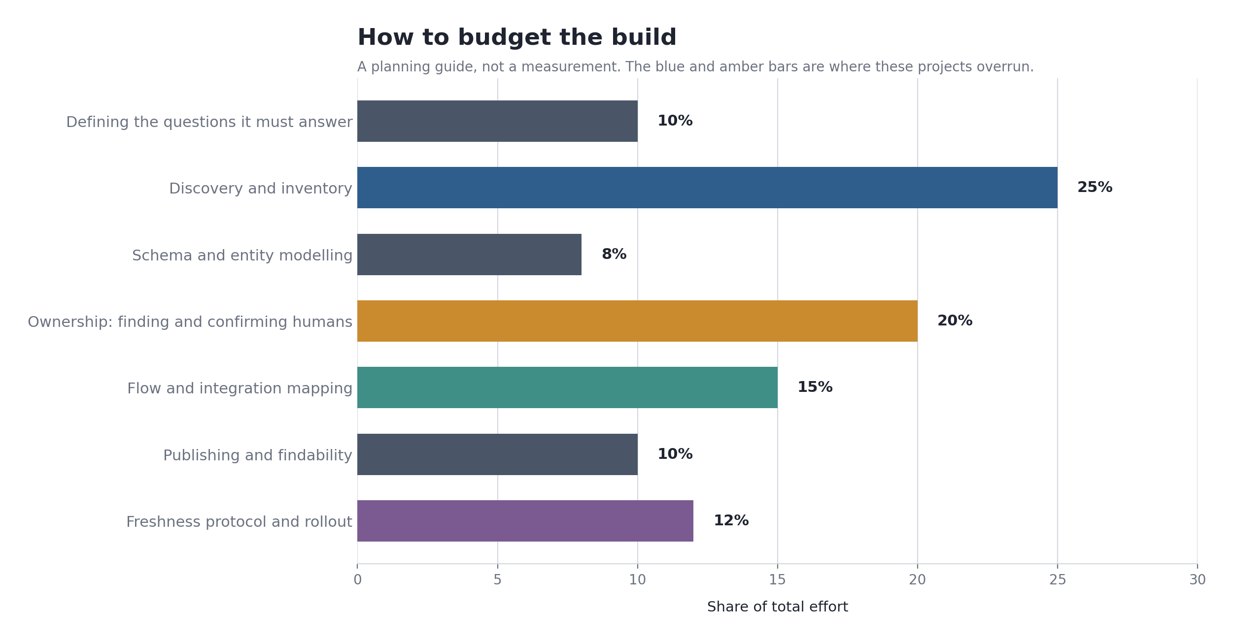
Start ownership earlier. I sequenced it after inventory because it seemed logical. It is the long pole, and it is blocked on other people's calendars. Start it in week one and let it run in parallel.
Version the schema from day one. I changed the field structure three times and had to migrate. A schema_version field costs nothing on day one and saves real pain later.
Model the manual processes sooner. I treated them as second class initially and had to go back. Manual steps are where the fragility concentrates.
Resist the completeness instinct harder. I spent time on low tier systems that nobody ever asked about, while a couple of tier 1 entries stayed thin for too long. Depth on what matters beats breadth across what does not.
Build the step through mode sooner. I shipped the graph first and added traversal later. Traversal is the feature that answers the question people actually arrived with, and everything before it was preamble.
Name the stewards before launch, not after. I treated handover as a closing phase. It should have run alongside the build, so the people who would maintain the atlas had a hand in shaping it and did not inherit somebody else's decisions.
Say no to the CMDB merge. Someone will suggest it. The purposes are different: a CMDB is optimized for machine consumption and operational accuracy, an atlas is optimized for human orientation. Link them, do not merge them.
Steal this
If you want to start on Monday, here is the compressed version.
- Write the seven to ten questions your atlas must answer. Show the list to three people who would use it. Cut anything that does not earn its place.
- Build the first inventory from billing, identity logs, and deploy configuration. Not from a survey.
- Define a schema before you define a template. Use stable meaningless IDs, roles instead of names, and an explicit confidence field.
- Go to humans with a draft to correct, never a blank form to fill.
- Publish the orphans. Escalate them as a finding.
- Require direction, mechanism, cadence, contract, and failure mode on every connection.
- Write decision records with an explicit "revisit if" condition.
- Put the whole thing in version control and validate it in your build pipeline.
- Make the graph the landing view, make every relationship a link, and give every state its own URL.
- Build a step through mode that walks the blast radius one hop at a time, with a breadcrumb.
- Name a steward per domain, along domain seams rather than the org chart. Give them a nudge, not a meeting.
- Roll out by answering questions with links, not by announcing.
- Run the new hire test. Everywhere they get stuck is a bug.
The map is the easy part. What is hard is the schema discipline, the ownership conversations, the interface that makes relationships walkable instead of readable, and the machinery that keeps the whole thing from quietly going stale once you stop looking at it. Get those right and the pictures more or less draw themselves.
And the honest reason any of this is worth doing: the cost of not having it is invisible but constant. The widely cited McKinsey Global Institute figure puts time spent searching for and gathering information at roughly 1.8 hours per employee per day, close to a fifth of the working week (McKinsey Global Institute, 2012). Treat that number as directional rather than precise, because it gets repeated far more often than it gets sourced. But anyone who has watched a team spend a morning reconstructing what talks to what already knows the shape of it is right.
An atlas does not eliminate that cost. It just stops you paying it over and over for the same question.
References
Brown, S. (2018). The C4 Model for Software Architecture. InfoQ. https://www.infoq.com/articles/C4-architecture-model/
Brown, S. C4 Model official site. https://c4model.com/
Conway, M. E. (1968). How Do Committees Invent? Datamation, 14(4), 28-31. https://www.melconway.com/Home/Committees_Paper.html
DORA. Capabilities: Documentation Quality. https://dora.dev/capabilities/documentation-quality/
DORA. Research program index. https://dora.dev/research/
Forsgren, N., Humble, J., and Kim, G. (2018). Accelerate: The Science of Lean Software and DevOps. IT Revolution.
McKinsey Global Institute (2012). The Social Economy: Unlocking Value and Productivity Through Social Technologies. https://www.mckinsey.com/industries/technology-media-and-telecommunications/our-insights/the-social-economy
North Highland. Application Portfolio Management: 6 Key Elements for Success. https://northhighland.com/insights/guides/application-portfolio-management
Nygard, M. (2011). Documenting Architecture Decisions. https://cognitect.com/blog/2011/11/15/documenting-architecture-decisions
Architectural Decision Records community site. https://adr.github.io/
ServiceNow Community. Application Portfolio Management: Inventory Best Practices. https://www.servicenow.com/community/enterprise-architecture-forum/application-portfolio-management-inventory-best-practices/m-p/1016198
Skelton, M., and Pais, M. (2019). Team Topologies: Organizing Business and Technology Teams for Fast Flow. IT Revolution. https://teamtopologies.com/book
Virima (2026). Application Portfolio Management Best Practices. https://virima.com/blog/application-portfolio-management-best-practices
Zylo. The Definitive Guide to Application Portfolio Management for SaaS. https://zylo.com/blog/application-portfolio-management