


Visualizing Delivery with Python
- Rick Pollick

- Apr 1
- 10 min read

Visualizing Delivery with Python: My Azure DevOps Version Reporting Script
Let’s be realistic —delivery data in Azure DevOps can get messy. You’ve got teams working on different products, fixing versions, different story point velocities, and everyone wants to know: Are we on track for the next release?
That’s exactly why I built this Python script—to turn the chaos into clarity.
Why I Wrote This Script
I needed a better/simpler way to answer simple but critical questions:
How many story points are done vs. left?
Which teams are pulling their weight?
Are we pacing toward completion by the release deadline?
We were already tracking work in Azure DevOps (ADO), but the out-of-the-box reporting wasn’t flexible enough. So, I rolled my own solution—automated reports that track cumulative and per-team delivery progress, highlight velocity assumptions, and visualize time-to-completion.
What the Script Actually Does
This script pulls work item data from Azure DevOps using their REST API, filters for a specific release version (FixVersion), applies team-level velocity assumptions, and generates clear, concise visualizations in Matplotlib.
Core Features:
Connects to ADO using a personal access token (PAT)
Queries work items for a specific project and release version
Categorizes by team based on AreaPath
Estimates progress and time to completion using hardcoded team velocities
Produces graphs like:
Team-level burnups
Cumulative release-level burnup
Estimated weeks to finish
A Look at the Code
Here’s how the magic starts:
import requestsimport pandas as pdimport matplotlib.pyplot as pltimport base64This section brings in all the necessary libraries:
requests: for making API calls to Azure DevOps.
pandas: to organize and manipulate tabular work item data.
matplotlib: for generating the visual reports.
base64: to encode the Azure DevOps Personal Access Token (PAT) for authentication.
ADO_PAT = "###"ORGANIZATION = "XXX"PROJECT_NAME = "XXX"FIX_VERSION = "###"API_VERSION = "7.0"This section defines the scope: which organization, project, and release (FixVersion) you want to report on.
# Encode PAT for Azure DevOps REST APIencoded_pat = base64.b64encode(f":{ADO_PAT}".encode()).decode()HEADERS = { "Content-Type": "application/json", "Authorization": f"Basic {encoded_pat}"}What it does: Sets up authentication for calling the Azure DevOps REST API.
Velocity Lookup and Filtering
After pulling and organizing the work items, the script looks up velocity by team name:
velocity = HARD_CODED_VELOCITY.get(team_name, 0)Teams with 0 velocity are either:
Excluded (e.g., “Architecture”, “Product Development Team”), or
Flagged so leadership can assign a proper velocity later.
Only active, velocity-assigned teams are included in cumulative burnup forecasting.
Then it pulls each work item individually and calculates team names from AreaPath.
Custom team velocities are hardcoded:
HARD_CODED_VELOCITY = { "TEAM Name 1": 70, "TEAM NAME 2": 62, "Team NAME 3": 60, "Team Name 4": 95 # others default to 0 or are excluded}EXCLUDED_TEAMS = ["XXX", "XXX", ...]These dictionaries let you:
Define team-specific delivery velocities (story points per week).
Exclude certain teams from the cumulative report (useful for shared services or inactive teams).
Why it's powerful: You can customize velocity assumptions without touching any external system—just change the dictionary.
for work_item_id in work_item_ids: item_url = f"https://dev.azure.com/.../{work_item_id}" ... team_name = item_data["fields"].get("System.AreaPath", "").split("\\")[-1]Iterates over each work item and pulls detailed fields such as:
State (e.g., Done, Active)
StoryPoints
AreaPath (used to determine the team)
IterationPath
Product
Custom.FixVersion
Why this matters: This gives you the full context needed for filtering, grouping, and estimating progress.
Next, the script queries ADO using WIQL:
query = { "query": f""" SELECT [System.Id], [System.WorkItemType], [System.State], [Microsoft.VSTS.Scheduling.StoryPoints], [System.AreaPath], [System.IterationPath], [Custom.Product] FROM WorkItems WHERE [System.TeamProject] = "{PROJECT_NAME}" AND [System.WorkItemType] NOT IN ("Epic", "Feature") AND [Custom.FixVersion] = "{FIX_VERSION}" """}Sends a WIQL (Work Item Query Language) query to Azure DevOps to get a list of work item IDs matching your criteria.
Azure DevOps Querying with WIQL
The script uses WIQL (Work Item Query Language), Azure DevOps’ version of SQL, to pull in only the data that matters.
query = { "query": f""" SELECT [System.Id], [System.WorkItemType], [System.State], [Microsoft.VSTS.Scheduling.StoryPoints], [System.AreaPath], [System.IterationPath], [Custom.Product] FROM WorkItems WHERE [System.TeamProject] = "{PROJECT_NAME}" AND [System.WorkItemType] NOT IN ("Epic", "Feature") AND [Custom.FixVersion] = "{FIX_VERSION}" """}Key Filters in the Query:
System.TeamProject: Only pulls work items from the selected project (e.g., “Product Development”)
System.WorkItemType: Excludes epics and features to focus on delivery-level work (like user stories and bugs)
Custom.FixVersion: Filters only items tagged with the specified release version (e.g., “1.5”)
This ensures the script is laser-focused on relevant delivery work tied to an actual product release—not planning items or upstream features.
query_url = f"https://dev.azure.com/..."response = requests.post(query_url, json=query, headers=HEADERS)What this does: Retrieves a list of relevant work item IDs (user stories, bugs, etc.) filtered by release version.
Fetching Full Work Item Details
Now that we have the work item IDs, the script loops through them to get full details:
for work_item_id in work_item_ids: item_url = f"https://dev.azure.com/.../workitems/{work_item_id}?api-version=7.0" item_response = requests.get(item_url, headers=HEADERS)Fields pulled include:
System.State (used to separate “Done” from everything else)
Microsoft.VSTS.Scheduling.StoryPoints (used to measure effort)
System.AreaPath (used to determine the team)
Custom.Product (used to group by product)
Custom.FixVersion (sanity check)
Grouping and Summarizing
After organizing the work items into a pandas.DataFrame, the script groups data in two key ways:
By Team
grouped = df.groupby("TeamName").agg({ "StoryPoints": "sum", "CompletedPoints": "sum", ...})By Product
grouped = df.groupby("Product").agg(...)In both cases, the script calculates:
Total story points
Completed story points
Remaining story points
Estimated weeks to complete = Remaining / Velocity
Estimated delivery date = today + estimated weeks
Finally, it visualizes cumulative and team-level delivery using matplotlib:
plt.figure(figsize=(10, 6))plt.title("Cumulative Story Point Progress by Team")plt.plot(dates, cumulative_points, label="Done")plt.axhline(total_points, linestyle="--", label="Total")plt.legend()plt.show()Data Aggregation
After pulling the data into a DataFrame, the script:
Filters out incomplete or irrelevant records
Groups data by team and product
Sums up story points by state (e.g., “Done”, “To Do”)
Applies hardcoded velocities to calculate estimated completion time
This creates the numerical backbone for your visual reports.
Generating Visual Output
The script generates several visual components using matplotlib:
Per-Team Progress Chart
Each team’s total story points vs. completed story points
Labelled bars for visual comparison
Estimated number of weeks remaining based on team velocity
Cumulative Burnup Chart
Aggregated across all active teams
Line graph of completed vs. total points
Velocity-adjusted forecast to finish
What the Output Looks Like
Here’s what you get when you run the script:
1. Per-Team View...
Horizontal stacked bars
One bar per team
Color-coded by completed vs. remaining work
Estimated weeks remaining (right next to the bar)
Clean Design Decisions
Here are some thoughtful choices that make this script especially practical:
No reliance on iteration dates: It uses simple math to forecast based on real pace, not calendar assumptions.
Team velocity is externally managed: Easy to adjust as needed.
Product grouping is optional but powerful: Not all organizations use the Custom.Product field, but when you do, this script pays off.
Self-contained and customizable: No dependencies on databases or cloud services—just plug and play.
Why This Logic Delivers Value
This isn’t just a random data pull. The logic behind the querying, parsing, grouping, and visualization is designed to:
Filter out noise (irrelevant work items)
Tie delivery to goals (FixVersion)
Hold teams accountable (velocity and progress)
Keep product owners informed (when features will land)
It aligns beautifully with the point from “It’s Not the Data, It’s You”: you don’t need more data—you need the right logic to use it well.
Want to Use or Extend This?
Want to swap FixVersion for Tags? Easy.
Want to add burndown over time? Just layer in historical queries.
Want to post this output to a Confluence page or email digest? That’s the next level.
How to Run It
Replace ADO_PAT with your Azure DevOps personal access token.
Update the FIX_VERSION and PROJECT_NAME to match your release.
Run it in any Python 3 environment with requests, pandas, and matplotlib installed:
pip install requests pandas matplotlibpython Version_Reports.pyDeep Dive: The Charts & Tables That Matter
The heart of the report is how it translates story points into predicted delivery timelines using custom velocities. Here's how each part works:
Team-Level Summary Table
What it shows:
For each team, the script produces a table that looks something like this:
Team | Total Points | Completed | Remaining | Velocity | Est. Weeks Remaining | Est. Completion Date |
TEAM NAME 1 | 140 | 70 | 70 | 70 | 1.0 | April 3, 2025 |
TEAM Name 2 | 62 | 20 | 42 | 62 | 0.7 | March 30, 2025 |
How it's calculated:
Remaining Points = Total - Completed
Velocity = From HARD_CODED_VELOCITY dictionary
Weeks Remaining = Remaining / Velocity
Estimated Completion Date = Today + Weeks Remaining (rounded up to next full week)
Why it’s valuable:This lets teams instantly know how far off they are from delivery—without needing a burndown chart or asking the scrum master.
Team Cumulative Progress Chart
What it shows:
A horizontal stacked bar chart that visualizes each team’s progress side-by-side.
Left side of the bar = Completed
Right side of the bar = Remaining
Text labels = Weeks Remaining based on velocity
Visual Elements:
plt.barh(teams, completed_points, label="Done")plt.barh(teams, remaining_points, left=completed_points, label="Remaining")plt.text(x_position, y_position, f"{weeks_remaining:.1f}w")Why it’s powerful:It becomes immediately obvious which teams are on track and which ones need help—without looking at spreadsheets or backlogs.
Product-Level Summary Table
What it shows:
Product | Total Points | Completed | Remaining | Combined Velocity | Est. Weeks Remaining | Est. Completion Date |
Epic/Feature | 210 | 100 | 110 | 130 | 0.85 | March 30, 2025 |
Epic/Feature | 90 | 20 | 70 | 62 | 1.13 | April 4, 2025 |
How it’s calculated:
Groups work items by Product (custom field)
Aggregates all teams working on that product
Combined Velocity is the sum of active team velocities contributing to that product
Remaining points and estimated dates are calculated just like in the team table
Why it’s important:Products often span multiple teams—this rolls their efforts together to tell the product owner when to expect delivery.
Product-Level Cumulative Progress Chart
This chart uses vertical bars, grouped by product, to show:
Total scope (stacked bar)
Completed story points (lower section)
Remaining story points (upper section)
Optional forecast line for delivery if visualized over time
Visual Breakdown (cont.):
plt.bar(products, completed_points, label="Done")plt.bar(products, remaining_points, bottom=completed_points, label="Remaining")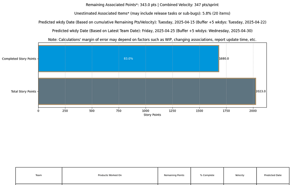
You can even overlay a marker for "Completion Date" as a visual target per product.
How Predicted Dates Are Calculated
The calculation is done through this logic:
estimated_weeks = remaining_story_points / velocityestimated_completion = datetime.date.today() + datetime.timedelta(weeks=estimated_weeks)Rounds up the result to avoid promising partial weeks.
Only works for teams with a non-zero velocity—others are either excluded or flagged.
Edge Cases:
Teams with velocity 0 are skipped & reported as "N/A".
If no velocity is defined for a product (because all teams working on it are excluded), it’s flagged for manual attention.
Bringing It Back to Delivery Value
These outputs tell three key stories:
Where you are today (current story point completion)
What’s left (remaining scope by team/product)
When you’ll be done (based on actual delivery pace, not gut feel)
And all of this is automated—no PowerPoint needed, no late-night spreadsheet wrangling.
TL;DR Summary
Component | Purpose | Value Delivered |
Team Summary Table | Shows status per team with forecasts | Helps with capacity and coaching conversations |
Team Progress Chart | Visual snapshot of team performance | Quickly identifies blockers or overperformers |
Product Summary Table | Aggregated cross-team delivery timelines | Product owners see when features will land |
Product Progress Chart | Visualizes delivery by product line | Helps balance scope across initiatives |
Value to Teams and Leadership
This script makes it easy to:
See real progress (not just open/closed ticket counts)
Understand whether team velocity aligns with goals
Forecast delivery timelines for product and project managers
Compare product lines across teams
Leadership gets confidence. Teams get direction.
In my previous blog post, "It's Not the Data, It's You," I emphasized that organizations often don't face a data shortage but rather challenges in interpreting and utilizing existing data effectively. This principle directly aligns with the motivations behind developing the Azure DevOps reporting script discussed earlier.
Bridging Data and Decision-Making
The script was created to transform raw Azure DevOps data into actionable insights. By automating the extraction and visualization of work item progress, it enables teams and leadership to quickly grasp project statuses without sifting through complex datasets. This approach mirrors the idea that the value lies not just in data collection but in its meaningful presentation.
Simplifying Data Consumption
Echoing the Apple-inspired philosophy from the previous post, the script focuses on user-friendly data presentation. It generates clear visualizations that depict team velocities, cumulative progress, and projected completion timelines. By reducing complexity, it ensures that stakeholders can effortlessly interpret the information, facilitating informed decision-making.
Proactive Data Delivery
Instead of requiring stakeholders to navigate through Azure DevOps for updates, the script proactively compiles and delivers comprehensive reports. This proactive dissemination ensures that critical project insights are accessible, aligning with the strategy of pushing key information to decision-makers rather than expecting them to seek it out.
By integrating these principles, the script not only automates data reporting but also enhances the strategic value of the information presented, ensuring that teams and leadership can make well-informed decisions based on clear and accessible data.
Where Else This Can Be Used
You can repurpose this in any organization using Azure DevOps. It works well across:
Software delivery
Infrastructure migrations
Cross-functional initiatives tracked in ADO
Just change the query filters, update velocity assumptions, and map AreaPath to your teams.
And if you’re on Jira? You can replicate this same structure using Jira’s REST API.
Underlying Principles That Drive Delivery
Transparency: Everyone sees the same data.
Forecasting: Estimating using real velocity, not gut feel.
Accountability: Teams own their numbers.
Repeatability: Anyone can rerun the script at any time.
It’s fast, customizable, and bridges the gap between operations and insights.
Why This Matters (Again, It’s Not the Data…)
Just like I wrote in “It’s Not the Data, It’s You”, data doesn’t magically solve problems. What matters is how you shape it into insights and how accessible those insights are.
This script reflects those values:
It surfaces the right data at the right time.
It focuses attention on actionable forecasts.
It doesn't overwhelm—you get clean, readable charts.
It eliminates ambiguity—velocity is no longer a fuzzy number.
Instead of spending hours generating a status slide, you get a live, up-to-date visual that tells a story.
This Script Isn’t the Only Way—But It’s the Right Way for This Problem
Let’s be clear: the script is straightforward.
It pulls data using Azure DevOps’ API.
It filters and organizes with pandas.
It visualizes with matplotlib.
There are other ways to get similar outputs:
You could wire up Power BI with the ADO Analytics view.
You could create dashboards using Azure DevOps queries and charts.
You could even export CSVs and use Excel pivot tables.
But that’s not the point.
The value in this script lies in its targeted, intentional design to solve a very specific need in a repeatable, lightweight, low-cost way:
Leadership needs forecastable delivery data, not raw task lists.
Product teams need version-specific visibility, not just sprint views.
Analysts and scrum masters need consistency and clarity without wrestling with tooling limitations.
This script is a custom-fit tool backed by real-world understanding of how delivery happens—and how delivery gets blocked when the data isn’t framed the right way.
Sometimes, the Right Solution Is a Purpose-Built One
Sure, off-the-shelf BI tools and general dashboards have their place—but they often assume a generic problem and apply a generic solution.
What makes this script special is that it’s:
Flexible – Can be reused across versions, products, teams.
Scalable – Add more teams or refine velocity inputs easily.
Tied to your process – Not bolted on, but integrated with how you actually run delivery.
Sometimes, the smart move is to design the reporting and process around the reality of your team, not just what the platform “wants” you to do.
Why That Matters
This speaks directly to the theme in “It’s Not the Data, It’s You”:
You can’t wait for tools to fix clarity—you have to design for it.
You have to:
Define what your team needs to see.
Choose the right fidelity and frequency.
Build scalable, adaptable solutions that solve your problems.
That’s what this script is. It’s not over-engineered. It’s just right-engineered—for the real-world delivery issues we face every week.
If that resonates with you and you want help building lean delivery intelligence around your product or program workflows, I’d love to talk.
Let’s build something that’s not just smart, but right.
Useful Resources
Matplotlib Documentation